


Legibility
Typography - Flash Cards


OVERVIEW
Legibility is the ease with which a reader can recognize individual characters in text. The legibility of a typeface is related to the characteristics inherent in its design, which relate to the ability to distinguish one letter from the other. Legibility is also a method of choosing a typeface for a specified purpose or to convey a message or article in most efficient way. So in this assignment, I have come up with few suitable typeface for different occasions or purpose.
OBJECTIVE
To show the characteristics of different typefaces and demonstrating the use and the applications of typeface based on given categories
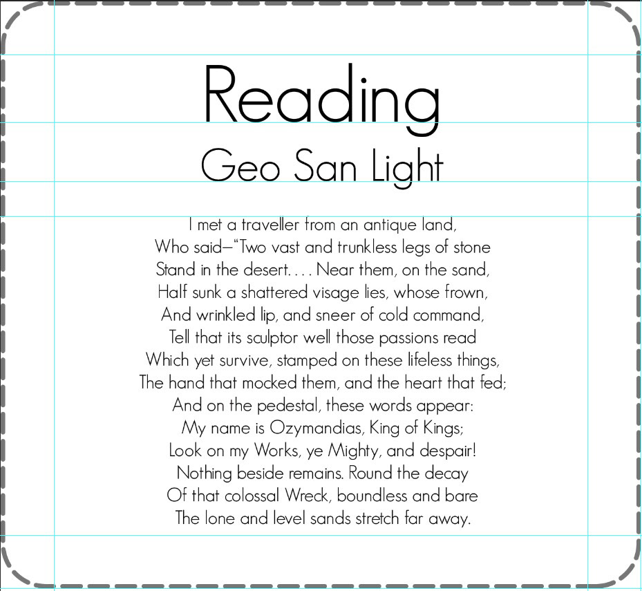
READ
SKIM
CONSULT
WAYFINDING
WRITING ANSWER
BEING SEDUCED
BEING MOVED
MULTITASKING
TARGET AUDIENCE
Graphics designers, editors and publishers’ who are looking for a suitable typeface under right category.
RESEARCH
I started research regarding fonts and typeface in order to know what legibility and how a typeface adds flavour and characteristics to the body of message where it been used. By the end of my research I ended up with a bunch of typefaces.
TYPEFACE
These are the list of typefaces used in making of this project...
ROBOTO by Google
Feeling Lovely by Subectype
Blue Highway by Typodermic fonts
Bagadang by Alfaraby Studio
Lato Light by Łukasz Dziedzic
Calibri by Lucas de Groot
In order to represent the typeface I needed some sort of statements or paragraph which is short and easy to display. So I went with one of my all-time favourite poem called “OZYMANDIAS” by Percy Bysshe Shelley. The meaning or themes of Percy Bysshe Shelley's poem “Ozymandias” are fairly straightforward and are also highly traditional. Basically, the poem reminds powerful people that their power is only temporary. However much powerful people may wish to think that their power is immortal, they are only deceiving themselves. This is why I feel this poem was suitable for displaying different types of typefaces. This concludes my research on what goes in to the final work.
IDEAS
From the research, I study about different fonts/typefaces and how their character change the message delivered. So I thought of few styles to represent it...
STYLE 1 - CHINESE PAPER HAND FAN
Paper folded with typeface contents on either sides.
Like the Chinese handmade paper fan, it’s made by folding a fixed portion of paper to either sides on after the other…
Since I chose to represent the Ozymandias poem written by Percy B. Shelly, the fan would be oversized.

So instead I went with the flash card where I can make individual typefaces no matter what the size is…
So for creating flash cards I went with A3 size sheet and started measuring for every typefaces so it would be easy to print and cut...

TECHNIQUES
To represent my chosen typefaces, I decided to make it in flash cards. So I used Photoshop and created A3 size document…
Document properties where set best suitable for printing.
I started dividing space for the typefaces with the help of guide lines.
The same measurement was followed for the entire 8 typefaces so that they don’t look off sized

Each guide lines where set for spacing and leading in order to make it more legible to the eyes…
First is the category, which is represented in 42point text size
A standard of 1.2 cm is given for leading

In the next line below, the typeface title is mentioned with 24point text size
The text sample begins after 0.7 cm of leading to create a simple and neat differentiation and to avoid the reader from suffocating with words put closed together
All the texts are centre aligned to give the poem representation

Each typeface samples are differentiated with a neat little none continues lie of border.
This also helps me in cutting without losing shape or cutting short
The border size is same for all the typeface samples
PRINTING AND CUTTING
The sheet used for printing is called “craft brown” of 300 gsm which gave a recycled paper kind of feel and a matching paper colour for the Ozymandias poem.

And made a small container for the type sample flash cards out recycling the paper left from trimming and cutting..


RATIONAL
My concept for Legibility sampler is to make flash cards for different typefaces. This flash cards were designed based on different categories like
READ – Geo San Light – the typeface itself looks weightless which gives you in ease of reading and I personally felt the typeface gave me flow of reading and continuity.
SKIM – Lato Light – this font was easier for me to skim through documents. The letters are easy to keep track and words forms in a comfort form.
CONSULT – Blue Highway – this typefaces is proven to be seen or can be read from a far distance in studies. Where I felt the font is neither bold nor regular, a bit of both gives the visibilities advantages.
Way Finding – Blue Highway Bold – this font is as same as the previous typeface, the only change is that the font used bold.
Writing Answer – Calibri Regular – this is a commonly used and easily recognized typeface by everyone.
Being Seduced – Feeling Lovely – the typeface is mix of calligraphy and cursive which also happens to carry some elements that relates to romantic style.
Being Moved – Bagadang – simple typeface with thick and thin strokes which seems to be relaxing for the eyes while reading. Has a bit of cursive and curviness to the letters to look smooth.
MULTITASKING – ROBOTO LIGHT – commonly used on multiple websites and blends perfectly were ever it’s been used and also happens to be designed by Google which make this typeface to be popular and easy recognizable. Hence I felt it suitable for multitasking.
After getting my contents straight, its printed on to Craft Brown sheet 0f 300gsm to get the look and feel of a recycled paper effect. The entire assignment was done with Photoshop.
Thank you…


